Introduction
When a client approached me with a request for a website that prioritized simplicity and elegance, I was excited for the task! Unlike many websites with information-packed landing pages, this client wanted a home page that acted as a gateway, letting users easily decide where to go next.
The challenge was clear:
On desktop, the client wanted a fixed menu on the left side of the screen to organize headings and subheadings.
On mobile, the menu needed to transform into a responsive, interactive experience that felt intuitive and engaging.
This is how I designed and built a menu system that not only met these requirements but went beyond them.
Defining the Challenge
The client’s vision centered on simplicity: a landing page free of clutter but informative enough to guide users. The desktop needed a fixed menu to the left, while mobile required a compact yet functional design that adapted to smaller screens.
To meet these needs, I had to balance usability with creativity. I wanted the menu to feel effortless to use on all devices while staying true to the client’s minimalist aesthetic.
My Thought Process
I relied on tools I’ve grown to trust through experience, allowing me to focus on the design and functionality:
Next.js’s App Router Layouts - Using layouts let me keep the menu consistent across pages while adapting it for different screen sizes.
Tailwind CSS - With its utility-first approach, Tailwind allowed me to style quickly and experiment with animations like animate-spin-1 for interactive touches.
React Icons - React Icons gave me access to clean, customizable icons. Switching between the hamburger menu and an “X” was straightforward and added personality to the design.
Framer Motion - Framer Motion simplified animations like sliding the content down on mobile and scaling the menu text slightly for an engaging user experience.
These tools helped me focus on solving the challenge efficiently, creating a solution I knew would look and feel great.
Showcasing the Result
The final solution brought the design to life:
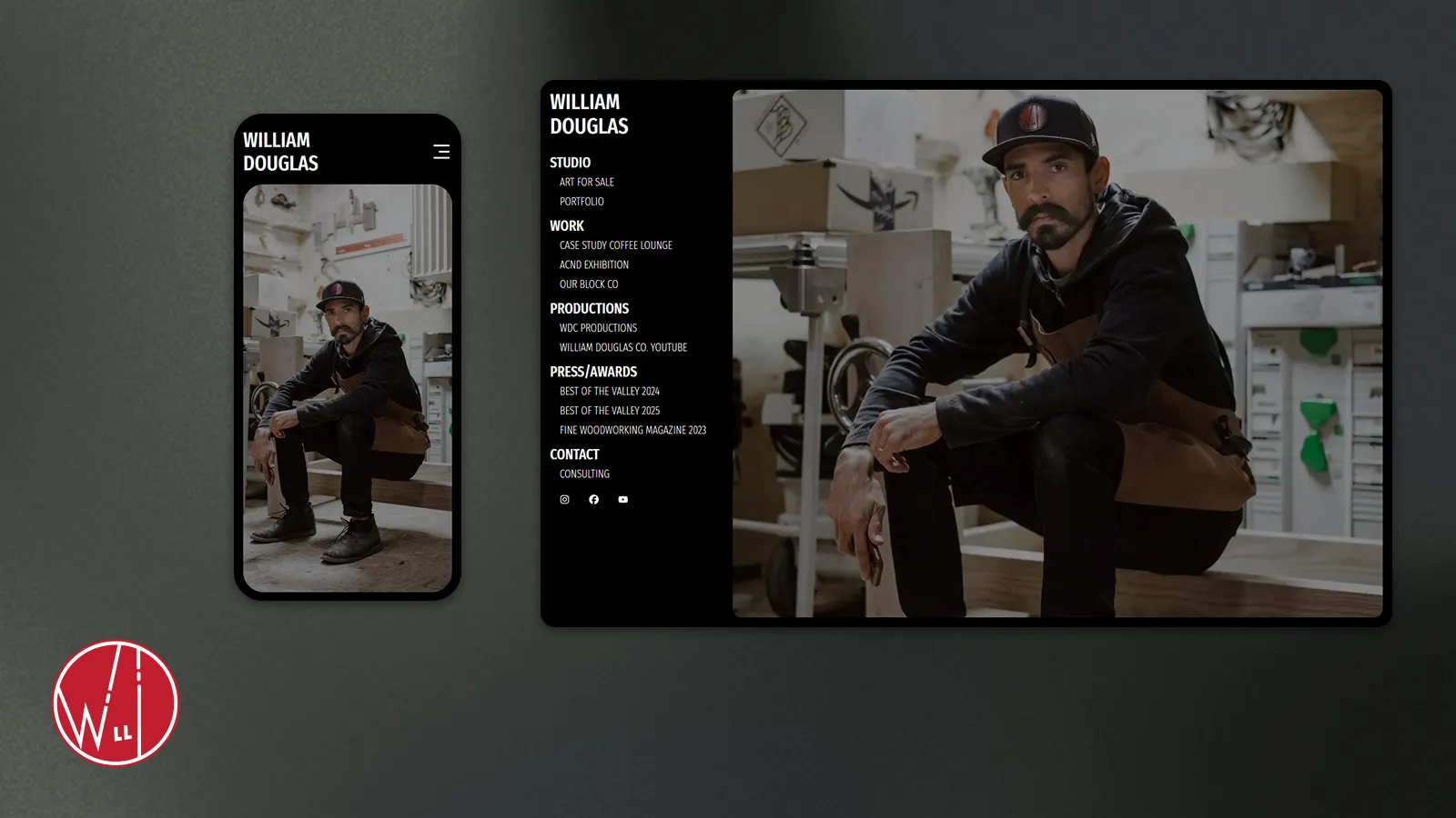
Desktop Navigation
The left-side fixed menu organizes headings and subheadings cleanly, allowing users to navigate without distractions.
The active status of each link is highlighted, ensuring users know exactly where they are on the site.
Mobile Menu Design
The menu transforms into a horizontal navbar with the client’s name as the logo and an animated hamburger menu. When tapped, the menu slides down smoothly, with text scaling slightly for a polished effect. Tapping a link closes the menu, sliding the page content back up.
Active Link Highlight
The active link styling provides clear feedback to users, enhancing navigation clarity.
__
Live Demo
Want to see it in action? Check out the live demo here: See the Interactive Menu System in Action on the Live Demo
Why It Matters
This project highlights the intersection of creativity, technical skill, and user experience.
For Developers: It’s an example of how tools like Next.js, Tailwind CSS, and Framer Motion can work together to solve real-world challenges.
For Business Owners: Thoughtful navigation isn’t just functional—it’s a key part of a website’s user experience. This menu system combines accessibility and polish to create a positive impression on users.
For Hiring Managers: This project demonstrates problem-solving, creativity, and attention to detail, showing how I approach challenges to deliver solutions that work.
Closing Thoughts
Whether you’re a developer looking for inspiration or a business owner considering your next website, this menu system shows how thoughtful design can transform a site’s navigation. If you’d like to discuss your own project or want to see more of my work, feel free to reach out!